Every Thursday we will be taking a look at logos from around sports. Whether they are designed interestingly, look absolutely terrible, or have a hidden message in them, no logo is off limits and hopefully you will learn something every week. Click here for link to previous Look At That Logo segments
Week 2 – Washington Capitals (secondary logo)
The Washington Capitals of the NHL have had multiple logos across their franchises history. Beginning with the red, white, and blue scheme at their inception, diverting to the teal and gold (heinous) look of the late 90’s, the Caps have settled back into the proper color scheme for a team in the nations capital.
The logo above is Capitals secondary logo, however it is by far one of the coolest logos not only in the NHL, but in all of sports.
At first glance, it is obvious the logo is showcasing the symbol of the United States – a bald eagle. Then, looking closer you notice that the eagles wings and head form a “W”, earning the logo the nickname “the Weagle”.
But, the real kicker that sets the logo even that much further apart from other logos. Take a look at the white space below the eagle’s head. That pointy white area seem to resemble anything?
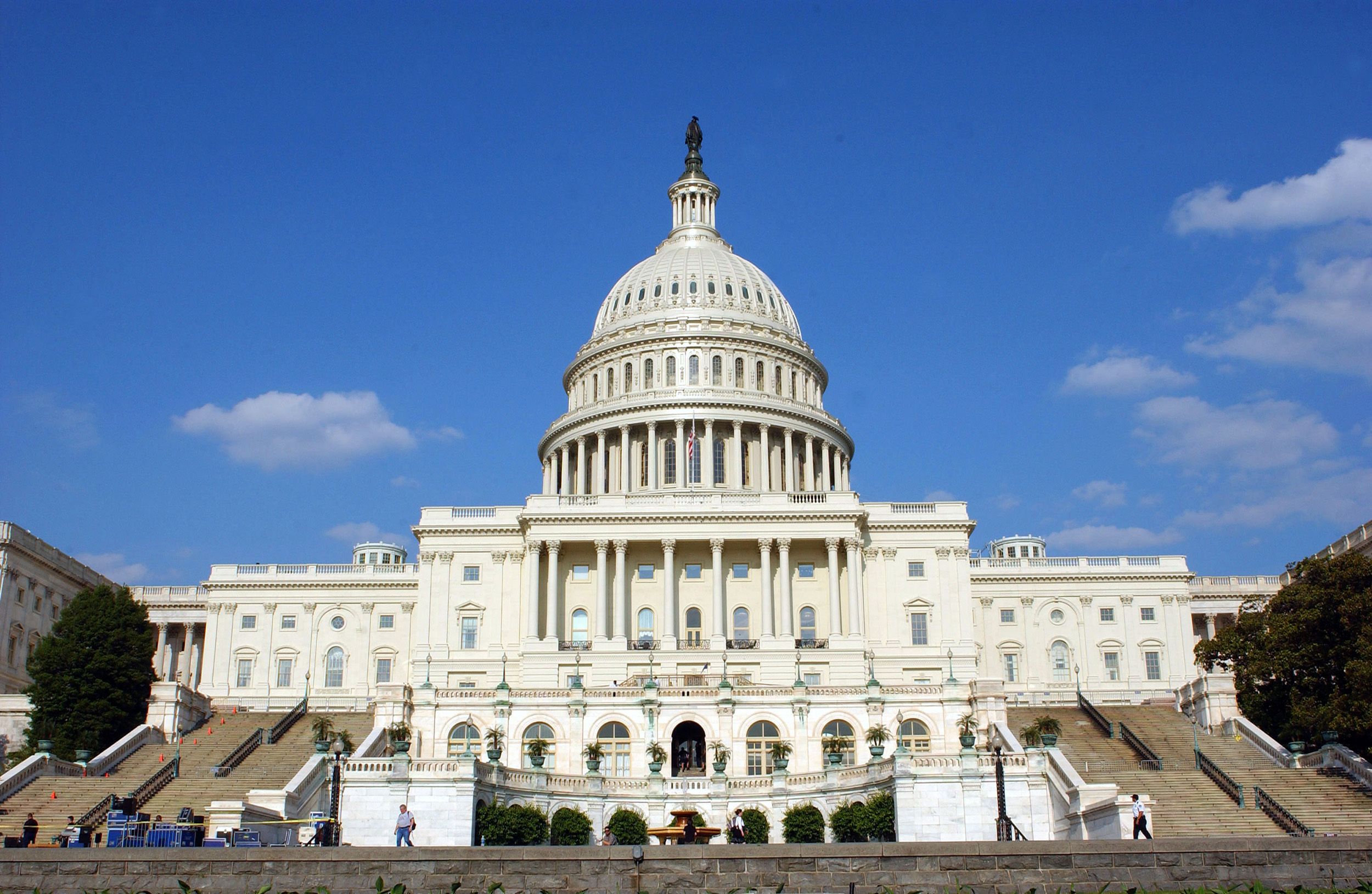
If you didn’t realize it before, you realize it now. That white space is an outline of the US Capital building in Washington D.C.
I would like to give all of my appreciation to those who designed this logo, making it one of my favorites in all of sports with the hidden capital building, RW&B, and the “Weagle” as a whole… as an American, how can you not dig this logo!
Have any cool logo suggestions? Let me know.
Till Next Time,
Trevor


Comments are closed